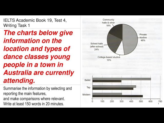
Introduction: The pie chart and the bar graph illustrate the data for the venue and the form of dance sessions, respectively, that children prefer to join in a particular town in Australia.
An introduction is always made by writing the question in your own words, without copying the words or glossary from the question. You can also think of moulding the sentences at your convenience.
Overview: Overall, it is quite obvious that these dance classes are mainly facilitated in private studios. Ballet is the top preference of learners below eleven, and modern dance form is the least liked by the same age group.
An overview is always made by combining two peculiar or unusual elements in the diagram. Some people report the trends, whether they are rising or declining, whereas others report the highest and the lowest figures.
It purely depends on the graph what exactly should be used. If you see that the trend is a zigzag and it is challenging to narrate, then talk about the highest and the lowest in such cases.
We are one of the best online and offline training institutes for clearing the IELTS, PTE, OET, and Duolingo exams in India. If you need any guidance, do not hesitate to talk to us at +918742928705 or +918527834578.


Add comment